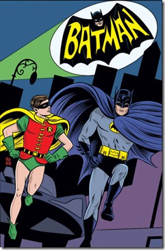

BATMAN ’66 #1 (DC) Jeff Parker, writer. Jonathan Case, artist.
For anyone with a nostalgic sense of loss and a craving for the campy and silly BATMAN 1960’s television series, this is the Batman book for you. As a junior high school student, I used to watch the television show (two shows per week in its’ prime) religiously and loved the irrelevant and mocking approach to a comics legend. I didn’t resent that then and I still don’t today. I have fond memories of the series but no real desire to see it again. Campy doesn’t work in the twenty-first century. I had a hard time finishing this first issue because I was bored. That’s not the fault of Parker and Case. They did exactly what they were assigned to do, and recreated the feel and look of that old TV show perfectly. I just don’t think this is what the present day Batman fan really wants. I predict a cancellation after six issues.
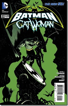
BATMAN AND CATWOMAN #22 (DC) Peter J. Tomasi, writer. Patrick Gleason, artist.
Since the demise of BATMAN AND ROBIN after losing one-half of the cast, BATMAN AND . . . is a team-up book on the surface with good one-issue-and-done stories with plenty of action lovingly illustrated (like the gorgeous Gleason fight panels in silhouette). Below the surface it remains a character study of Bruce Wayne and how he deals with his son’s death (highly reflective and brooding with strong and often violent feelings of retribution). That’s where the Tomasi-Gleason magic resides, and this title continues to surprise me. There are some great developments here regarding the continuing and welcome presence of Carrie Kelley.

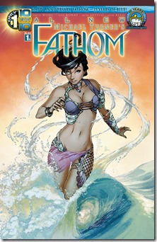
ALL NEW MICHAEL TURNER’S FATHOM #1 (Aspen) David Wohl, writer. Alex Konat, artist.
Upon the 10th anniversary of Aspen, and the 15th anniversary of FATHOM, Wohl and Konat do their best to recreate the Michael Turner magic in this fifth volume of the title. All this and only a $1 cover price should be enough to entice everyone to give this a quick look. Wohl knows his way around the Fathom universe (having worked with writer/creator/amazing artist Michael Turner on FATHOM as well as WITCHBLADE), and nails the essence of Aspen Matthews in this first issue. Part of the magic of the original was the beautiful and colorful Turner art, and that’s a hard act to follow. Alex Konat does a decent job, and in places like the opening pages he rivals Turner in his illustration. But Turner did it on every single page, panel after panel and Konat isn’t quite up to that level. Some of the pages are standard fare in terms of art. I don’t think Aspen needs to assign this to a different artist - - they just need to find a way to bring out the best of Konat the same way that Turner gave 110% every time.
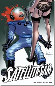
SATELLITE SAM #1 (Image) Matt Fraction, writer. Howard Chaykin, artist.

Combining a murder mystery with a realistic depiction of live television in 1951 New York City, SATELLITE SAM kills off its title character in the first issue as it sets up the background for what could be an interesting series. Chaykin has always had a knack for recreating a certain point in time that rings true, all the way down to the clothing styles and furniture. Credit Fraction for doing some research on the early days of television and providing some good insights into what it must have been like to work in that media back then. The choice of black and white illustrations to tell this story also helps give things the right feel and look. It’s too soon to tell if this will become a routine pot-boiler from this point on, or provide further delightful insights into America’s history of popular culture like this first issue does so well.
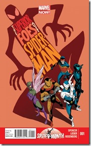
THE SUPERIOR FOES OF SPIDER-MAN #1 (Marvel) Nick Spencer, writer. Steve Lieber, artist.

A new series that focuses less on Spider-Man and more on the history, motivations and personal lives of its five villains is a different and welcome spin on all things Spider-Man (Doc Oc version, that is). That seems to be the premise of this book, as Spider-Man appears in only two panels throughout the entire first issue. Too bad the story tries a little too hard to be funny, and ends up being silly, sappy and moronic. These characters (Boomerang, Shocker, Overdrive, Speed Demon and Beetle, the new Sinister Six minus one) and Hammerhead are mostly depicted as pure idiots. The art style (and situations within) would fit in with books intended for younger audiences, but the T+ rating on the cover seems to indicate a broader target. I have higher expectations from Nick Spencer. This is disappointing.
